


Tips on how to updating your branding colors on your showit website

I have tips tips on how to make your life easier when you are updating your branding colors on your showit website One of the first things you set up when designing a website is setting up your design colors. This is a quick read to help you set up your design settings on your Showit website.
Certain elements are assigned colors based on the design settings, and when you make changes to those settings and save them, it will change all the elements assigned to those design settings numbers.
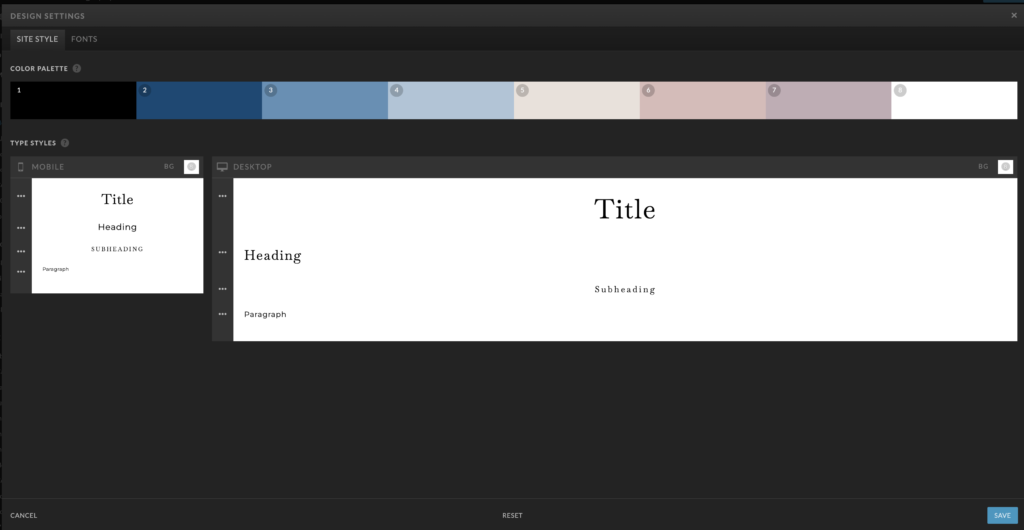
When setting up your color pallet – go to design settings – site style – color pallet.
Updating your branding colors on your showit templates
Most templates are designed similarly, and when you assign your branding colors in the design settings, the colors will change on the template.
Your branding needs to reflect you and your brand, and you choose colors that will resonate with you and your business.
01. Choosing your colors
The general rules are to choose two to three primary colors, 1-2 pops of color, and 1-2 neutral tones.
In showit, there are 8 colors you can set in your design settings to make it easier to keep your branding consistent. I usually set them up with darker colors on the left and lighter colors on the right.

02. Choose neutral and contrasting colors
The rich and contrasting tones bring to life your more neutral tones. Those more neutral tones may be too soft and light without those contrasting colors, so pick ones that pop!
03. BACKGROUND & TEXT COLOR(S)
Generally speaking, you will want to stick with a lighter background overlaid with darker text, or the complete opposite! Having alternating color backgrounds and branded photos helps make the website aesthetically pleasing and will keep eyes on your website. It will also help break up the different topics to keep the viewers intrigued. You also will need it super easy to read on all platforms, so you need to keep this in mind when doing your branding!

04. WHERE TO USE YOUR BRIGHTEST COLOR
This one is really quick and easy but has a high-level impact when you do it! Apply your brightest/boldest/most noticeable color(s) to your Call to Action buttons and/or text. We want the eye to gravitate easily to these buttons. After all, this is what you are working SO hard for! You want the user to purchase your product, subscribe to your list, and hire you! So make it easy for them to find that button and click it. Color is the quickest, most efficient way there!
If you want more detailed tips on setting up a template go to the blog here…

If you have questions or want to pick my brain feel free to email me at aimeedanielsondesigns@gmail.com, hit me on my socials, or schedule a free chat https://calendly.com/aimeedanielson/discovery-call?month=2022-06
If you have not signed up for showit yet, use my link and get your first-month free https://showit.co/?referralCode=aimeedanielson
CATEGORY
4/25/2024
POSTED
Tips on how to updating your branding colors on your showit website


COMMENT LOVE